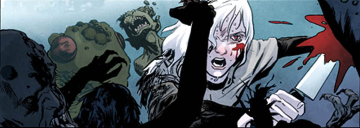
When you study an artist’s storytelling, the most important thing is to ask yourself questions about the work.
First, ask yourself what’s communicated by the look of the characters–their design, their clothing, their facial expressions and gestures. What “types” are the characters? How much can you tell about them without reading the story? Then note the space taken up by each character in a panel– What is the effect of that choice, and what effect does it have when compared with the size of the drawings in adjacent panels? Did an important thing get higher or lower from one panel to the next? Did it separate itself from a crowded background to stand out more clearly? Does one character seem to dominate a panel? Why did the artist choose one camera angle and not another? Often, an angle is chosen simply to put the most important storytelling element where it can be easily seen. If you need to show that the bad guy has a gun, give your reader a good look at the gun. If you want to show that someone is smiling, don’t show the back of his head. Another common reason for choosing an angle is to provide contrast with nearby panels. It can look awkward if the major elements in two panels both have similar shapes and tilts. The angles can also be chosen for expressive reasons. Look at the abstract shapes made in each panel, and characterize those if possible. Is the panel built on horizontals, verticals, diagonals? Do the elements move in one direction, or several? What sort of feelings do the shapes evoke? Are there threatening shapes? Explosive? Defeated? It isn’t hard to picture the difference between a “sad” tree and a “happy” one, but subtler effects can be created as well.
Look for motifs in the story. Do certain shots appear over and over? In “The Searchers,” a great John Wayne western, silhouettes are used to great symbolic effect. Several Eisner “Spirit” stories turn on the repetition of a gesture, as does one of the best chapters in Gilbert Hernandez’s “Poison River.”
Note the presence or absence of backgrounds and which details are there to let us know where we are. It’s often surprising how little it is. The difference between the wall of a flophouse and a room in a castle might be just the shape of a window. I can recall an Alex Toth panel where we know we’re in an enormous airplane hangar even though all we can see is part of the silhouette of the nose of an airplane and the white ellipses of the tops of a group of fuel drums. This kind of simplicity is hard to pull off. You’re a lot better off drawing everything first, and then figuring out what you can eliminate.
Take careful note of how key props and locations are established. Ask yourself why the artist chose certain close-ups. Sometimes a close-up is just there to break up the monotony of a page, or to give a bit more emotional juice to a big moment, but when a good storyteller closes in on a seemingly unimportant small object or gesture, there is usually a good reason.
Look for the contrasts in each panel and on each page – Tall vs. short, scared vs.pleased, busy vs. empty, organic vs. geometric, light vs. dark, clean vs. dirty. Ask yourself what impact does this contrast have? humor? pathos? awe? irony?
This approach to studying works best when you look at the work of a master comics craftsman- someone like Will Eisner, Steve Rude, Joe Kubert, David Mazzucheli, Vitorio Giardino, Milt Caniff, Alex Toth, Barry Winsor Smith, Jaime Hernandez, Dave Gibbons, or Bernard Krigstein, to name a few. (Art Spiegelman wrote a lengthy analysis of this sort of B Krigstein’s great EC story “Master Race.” Each panel took a paragraph or two. If you can somehow find a copy of the Krigstein issue of an old EC Fanzine called “Squa Tront,” you’ll learn quite a bit.) And most of my analytical questions can be applied to movies as well. Watch older movies- pre 1960. They didn’t use as many flashy camera movements and quick cuts back then, so the storytelling is clearer, more direct and easier to study.
Dealing with all of these choices at once is a lot like juggling. Tossing & catching one ball is just a simple motor skill, two is a little tougher, three takes practice, and each new ball you toss in increases the difficulty. Keep at it. You’ll get better.
